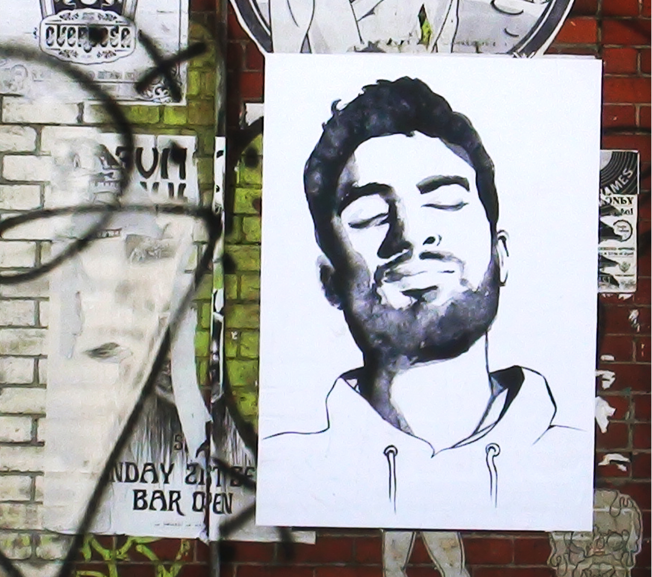
POSTER
Marco
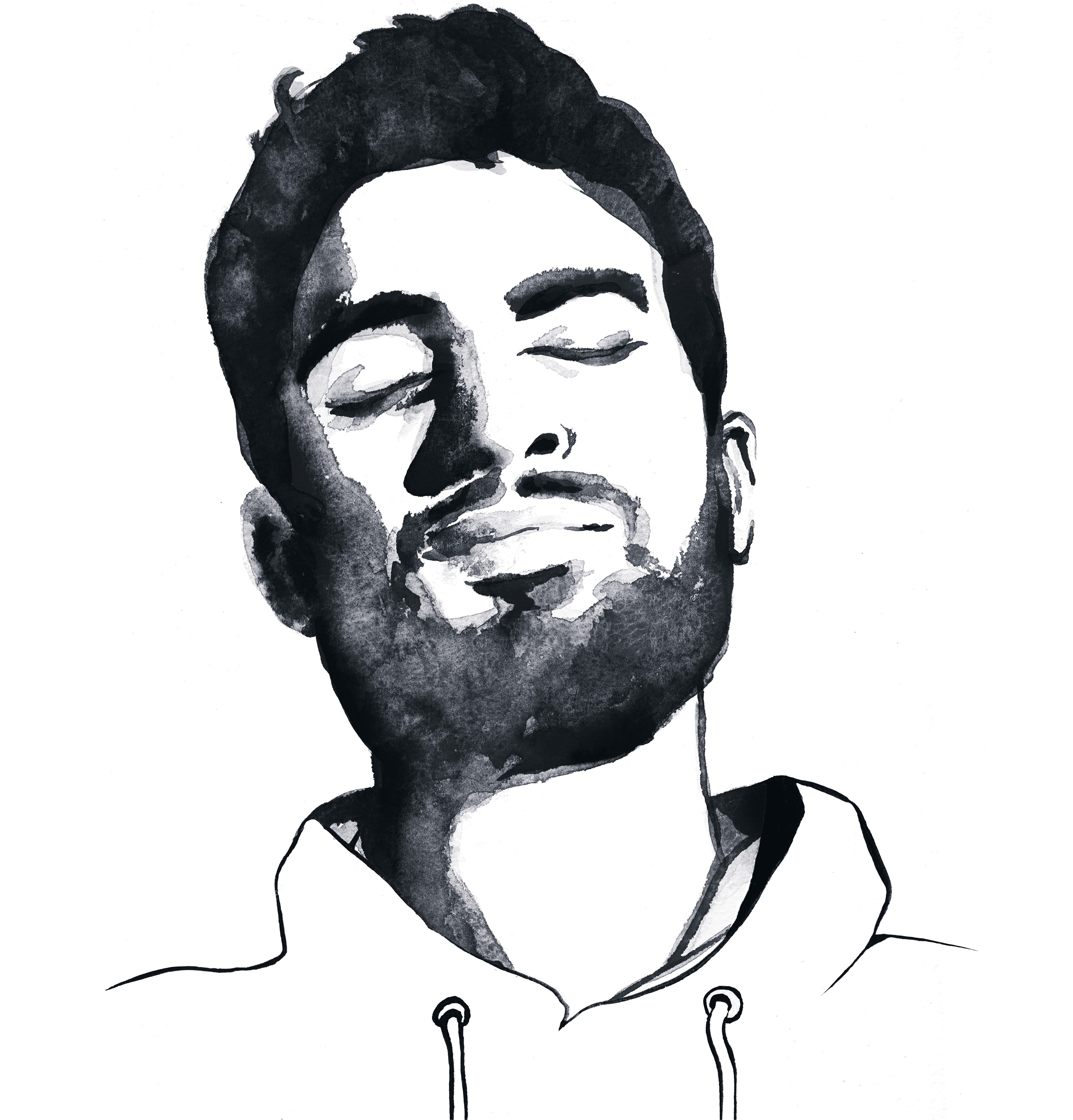
As a person addicted to digital art-making processes and the ever-present escape route of "undo", I'm simultaneously fascinated with the uniqueness, inaccuracy and permanence of real-world mark-making media such as ink and paint. I wanted to make a portrait out of composite attempts at tracing the same face, each attempt incorporating natural deviations of the hand. My aim was to find out whether, when combined, the differences between the drafts would combine to yield something close to the original image. I used the very handsome face of Marco, a film-director I met at a film festival in Rome. The resulting artwork was blown up, printed and pasted in Fitzroy, Melbourne.
Artwork
Separation
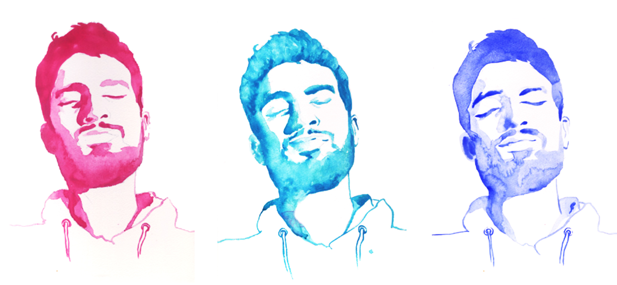
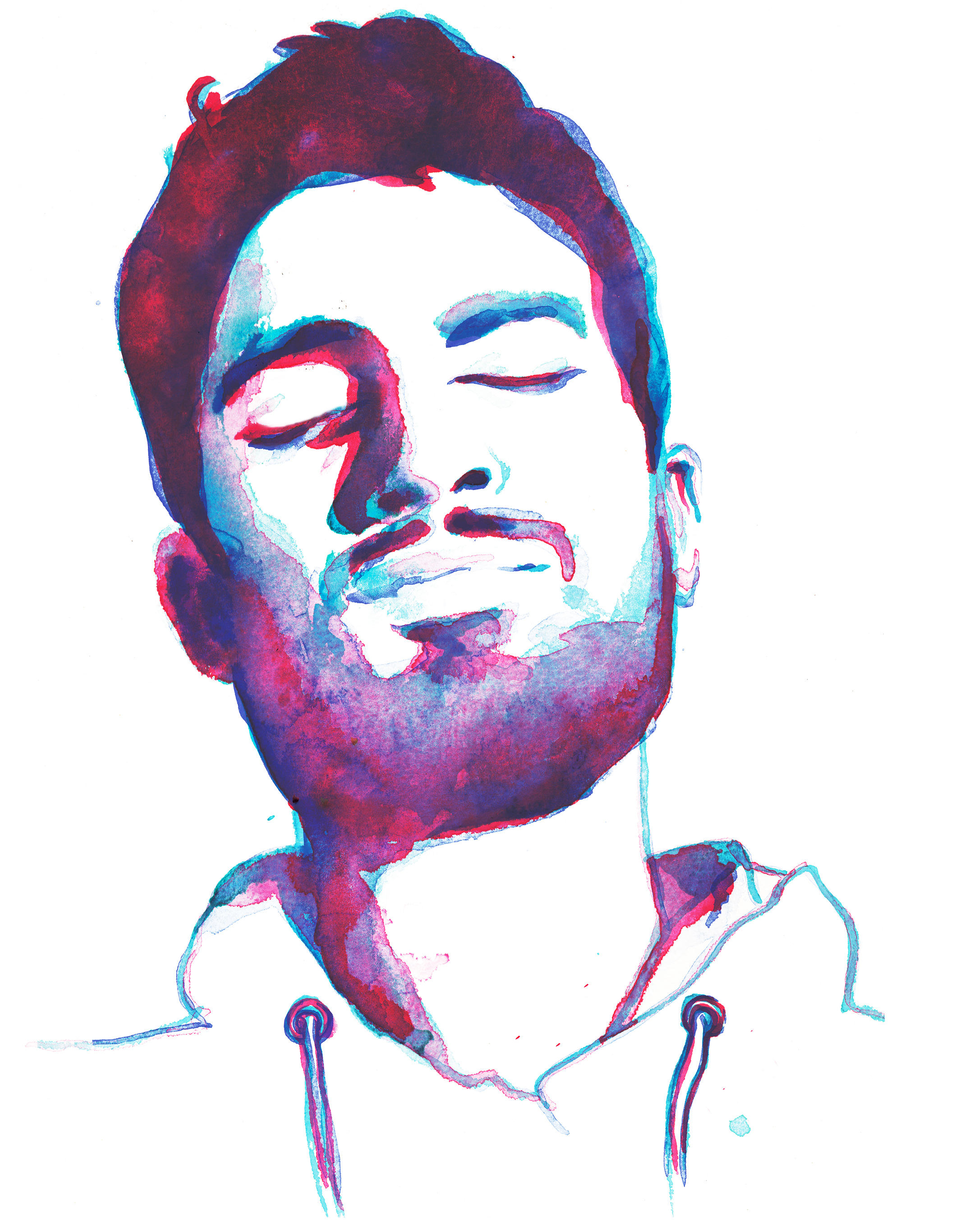
I printed Marco's face out and directly traced the contours, in red, green and blue ink, using a homemade lightbox (aka pane of glass and a lamp). Each result looked very different. I then combined all 3 images in Photoshop - whereas each of the three coloured versions felt like an approximation, the combination of the three felt closer to a representation of Marco's face.
Execution
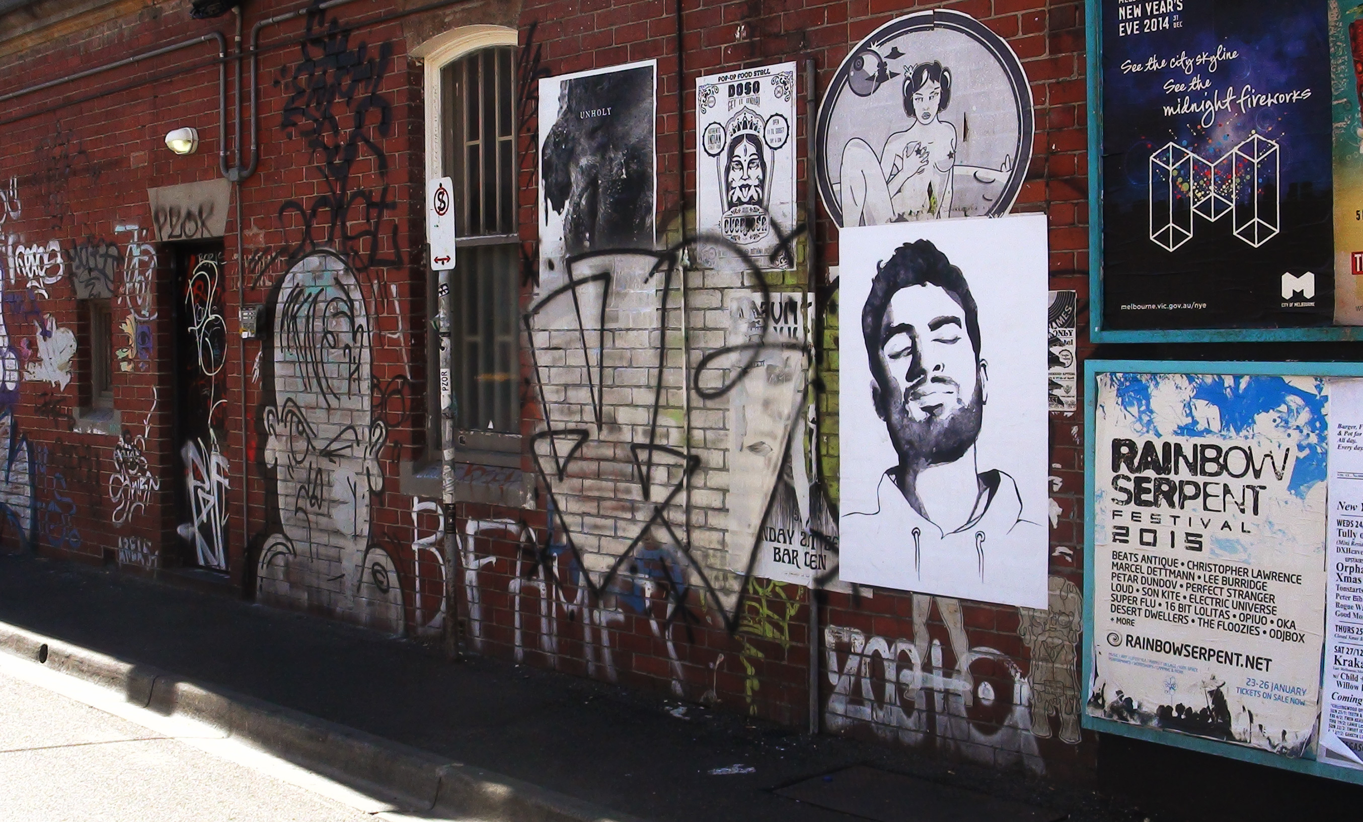
Street
The composite red, green and blue image was colour adjusted in Photoshop to make one composite black image. The work was then printed on B0 paper and pasted up in the heart of Fitzroy, Melbourne. One of the great pleasures of making pasteups is the conversation the work has with its surrounds once it's up - I wanted this work to live alongside other posters, without any kind of obvious message, hopefully inspiring questions around intended and accepted use of handsome faces in printed media.